
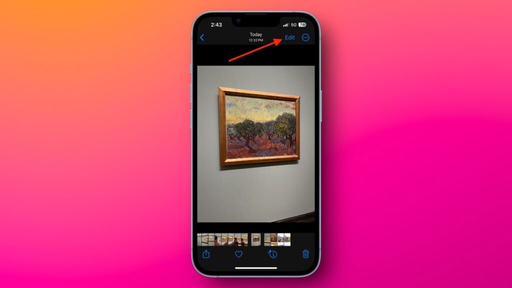
The Edit button has moved and been redesigned. In iOS 18’s Photos app, the Edit button is now located at the bottom of the screen, between the “i” and “Trash” icons. To find it, open any photo and look for an icon resembling an abacus. It took me a while to locate this new button, and even longer to connect it to the photo editing function (I guess it’s meant to represent sliders?). While I understand Apple’s desire to minimize text, I’m still accustomed to the iOS 17 version, where the “Edit” button was in the top-right corner of each photo—easy to spot and understand. Hopefully, future updates will bring back some of that clarity.

The redesigned Photos app isn’t as intuitive as before. My concerns go beyond just the edit button. Apple now places photos shared through iMessage directly into the main Photos feed, which adds unnecessary clutter. Additionally, the grid layout is now the default view, whereas the previous app displayed featured photos by default, allowing you to quickly browse through your favorite memories or Apple’s automatically generated slideshows (like ones featuring your pets or certain contacts). Now, all photos are displayed in a single view, making it harder to find specific types of photos unless you scroll down significantly. I hope Apple revisits this design to make the Photos app more user-friendly. As it stands in iOS 18, it looks sleek but isn’t necessarily an improvement over the previous version.